Robert Watts’ Iberianinspired activities will immerse children in the visual arts and might just transform your classroom in the process...
Few countries have a stronger claim to an artistic heritage than Spain, and Spanish artists are a great source of inspiration for creativity in the primary classroom. The artworks I remember most clearly from my own childhood were from Spain: paintings of market stalls in seaside towns brought home from our holidays. I’d never heard of Picasso, let alone Goya and Velázquez, and I wonder what I would have made of their work. Thanks to the internet, artworks by these artists are now freely available, and on these pages you’ll find a selection of practical activities inspired by them, together with links to a range of online images of their work.
Each of the activities focuses on a specific process – drawing, printmaking, collage, clay and ICT – and also on one or more of the elements of art and design: line, tone, texture, colour, shape, form, pattern and composition. By the end of term, children will have extended their knowledge and understanding of art, and created a collection of work that will transform your classroom!
Robert Watts is the coeditor of Teaching Art and Design 3–11: The Essential Guide, published by Continuum Books.
 Line drawing with Picasso…
Though Picasso is famous for distorting his subjects’ features, one of his greatest talents was for simplifying shapes and reducing complex forms to a collection of fluid lines. Art critics talk about an economy of line, the idea being that the essence of the subject is captured in a few swift strokes – less, as they say, is more. In a wonderful sequence of lithographs (http:tiny.cc/rgm60) you can see Picasso creating a detailed drawing of the bull, before repeatedly reworking the lithography plate, reducing the image to its essentials.
Drawing from life is always preferable to drawing from photographs, but in this case – unless you happen to have wild animals roaming the playground – you could make an exception.
Try:
• Provide children with a number of images of animals, and prompt them to describe the shapes and lines they can see.
• Ask children to select one image and try to recreate it in a drawing using as few lines as possible. At first, children will be keen to include the details they think are necessary to make their picture recognisable, but with practice they will see that the shapes they create have a life and energy of their own.
• Encourage children to make a number of quick drawings in a short space of time, and challenge those who find it difficult to ignore detail to put their pencil in their other hand and start drawing – it’s a good way to liberate young artists!
 Collage and composition with Velázquez…
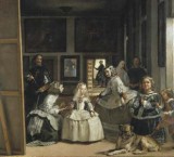
If your children were able to ask Picasso for tips on improving the composition of their artwork, he might suggest they ask the real expert – Velázquez. Velázquez was a huge inspiration for Picasso, and his most famous painting, Las Meninas (spanisharts.com/prado/velazquez. htm), was one that Picasso copied and re-interpreted many times.
We often talk to children about the composition of their stories, but less often about the composition of their drawings and paintings. Just as children compose their writing in order to ensure that words and ideas are sequenced to form a unified whole, visual composition is also concerned with the ways in which the parts of a picture ‘fit’ together.
Try:
• Get children to look at a selection of their own drawings – they’ll probably find that the objects in the pictures are allocated their own space, not touching or overlapping anything else. Now ask them to study Las Meninas and to notice how the way that Velázquez has overlapped figures and objects helps to create a sense of space in the painting.
Collage is a great way of exploring composition, for two reasons. Firstly, shapes can be assembled on the page and rearranged before being stuck into place. Secondly, children can experiment with overlapping cut-out shapes to create dynamic compositions.
Try:
• Make photocopies of children’s figure drawings from previous lessons, enlarging some and reducing others. Ask children to cut around the figures in the drawings and assemble them into a collage – you’ll find that, with a little thought about composition, the images spring to life.
 Tone and texture with Goya…
It’s hard to imagine Goya trying to tempt ladies into his studio by inviting them to come up and see his etchings. The gruesome battle scenes of his Disasters of War series would have startled the bravest of señoritas.
Some of the less terrifying images can be found at en.wikipedia.org/wiki/The_Disasters_of_War and are a great starting point for exploring tone and texture. Children can easily develop slightly lazy scribbling habits when it comes to creating tone in their drawings, and they’re often inclined to make repeated marks on the page without reflecting on how they could be developed.
Try:
Encourage children to look closely at the ways in which Goya created tones and textures by carefully engraving lines into his etching plate, then provide them with a selection of drawing tools to create their own textures. Children should start with abstract shapes or strips of contrasting textures, before applying what they’ve learned to the next drawings they make.
Colour, shape and pattern – ICT with Miró...
I suspect that if computers had been around when Joan Miró was at primary school, he would have been one of those boys teachers had to drag away from the keyboard. Miró carried out endless experiments with colour, shape and pattern in his abstract paintings (see joanmiro.com), all without an ‘undo’ button or a ‘cut and paste’ function in sight.
Even the simplest of paint programs offers opportunities for children to explore a huge range of options for creating engaging images. With more complex programs, there are sometimes too many choices of tools, colours, shapes and effects, and children often become bewildered by the options.
One solution is to do what Miró did, and restrict the range of options available.
Try:
• Set children the challenge of creating compositions of shapes with: no straight lines; only straight lines; shades of blue; overlapping shapes. Alternatively, ask children to create their own rules – after all, that’s what each of these Spanish artists decided to do…
 Clay forms with Gaudi…
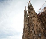
Visitors to Barcelona are stunned by the architectural adventures of Gaudi (sagradafamilia.cat). His experiments with curving, sinuous shapes appear to break every architectural rule in the book – and you can’t look at them for long before running to the art cupboard in search of the clay.
All work with clay should begin with informal experiments: whatever their age, children need time to investigate the properties of the material for themselves. Once they become more confident, introduce images of Gaudi’s structures and encourage children to describe the forms they can see.
Younger children can work on flat clay tiles, adding extra pieces and manipulating them into Gaudi-esque shapes, while older children can be challenged to make clay structures that are self-supporting. Try working in groups, with each person contributing a wall, floor or roof to the structure.
Stimulation for Children Funds for Schools Support for Art http://www.apfs.org.uk 0800 027 1939
How To Use Books To Help Children Cope With Life
Ace-English
Easy ways to combat teacher stress
Ace-Heads
Teaching five year olds to talk
Ace-Classroom-Support
